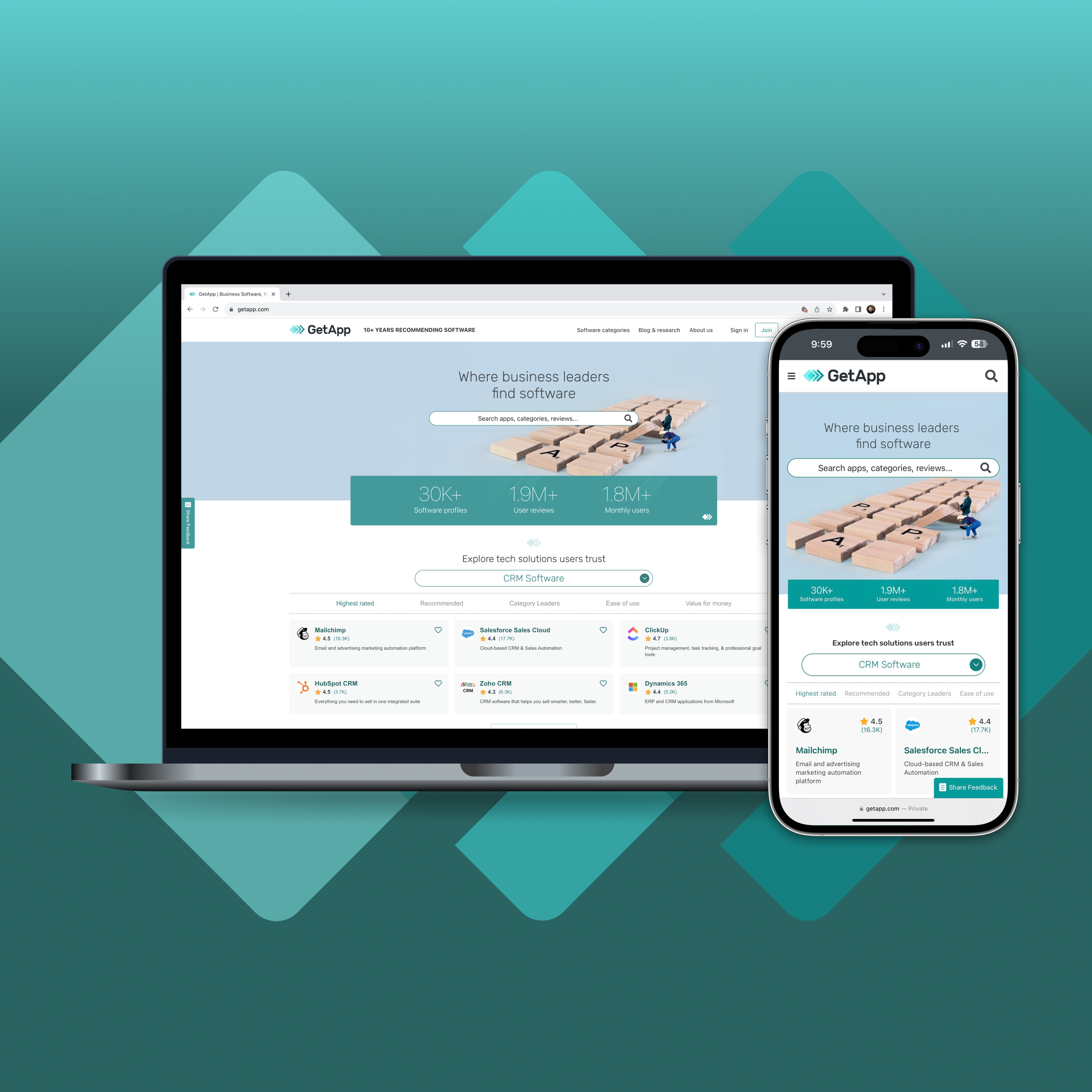
CONNECTING SOFTWARE BUYERS TO SOFTWARE USERS
Understanding the Value of Social Proof on GetApp
PROBLEM
According to research from 2022, 95% of consumers read online reviews before purchasing a product.
At GetApp, a brand nested under the umbrella of Gartner Digital Markets, we recognized a challenge: while users visited our platform in search of the best software options, there was a clear gap in harnessing the influence of social proof and user-generated content.
As the lead UX researcher, it was clear to me that merely providing software options wasn't enough; we needed to cultivate trust and provide users with the social validation they sought.
SOLUTION
In tandem with a diverse team based in Barcelona, I delved deep into the user's journey on GetApp, gathering hours of feedback and scrutinizing every interaction. Recognizing the potency of social proof, my findings demonstrated the power of the feature rating comparisons on GetApp. Additionally, I advocated for the integration of "User verdicts" videos, offering real-world insights into software options. Through these enhancements, we weren't just offering software solutions; we were crafting a holistic experience grounded in trust, authenticity, and relevance.
During this project, my adaptability strengthened as I navigated cross-cultural collaborations and time-zone challenges, always prioritizing user expectations and harnessing the power of comprehensive research to drive our vision.
Figure 1: Feature rating comparisons on GetApp.com.
MY RESEARCH PROCESS
PLAN
Right from the outset, I understood the importance of laying a firm foundation. With this in mind, I created a detailed research plan in Coda, outlining the objectives, scope, timeline, participant details, script, assumptions, hypotheses, and RACI roles. This step wasn't merely procedural; it set the trajectory for the entire project, aligning the entire team with a unified vision.
In the spirit of transparency and fostering teamwork, I provided stakeholders—from PMs and engineers to the product design team—with access to this plan. This approach not only promoted a collective perspective but also underscored the importance of inclusivity, ensuring every voice was heard.
Crafting the research blueprint was both invigorating and challenging. Every decision made had repercussions, and it was essential to balance stakeholder requirements with our users' needs. Amidst this balancing act, some of the most important requirements began to surface.
Figure 2: I used tools such as Dovetail, Figma, and UserTesting to unearth user insights.
TEAM
1 UX researcher
1 product designer
1 product manager
~6 product engineers
MY ROLE
Lead UX research
Moderator
Presenter
Facilitator
TIMELINE
Overall: 9 weeks
Planning: 1 week
Kickoff: 1 week
Execution: 1 week
Analysis: 3 weeks
Synthesis: 2 weeks
Share-out: 1 week
KICKOFF
Our team came together, with each member understanding their role in the broader scheme:
The prototype's design took shape as a high-fidelity prototype created in Figma.
I set up testing environments in UserTesting, aiming for relevant user interactions and feedback.
A dedicated project space was established in Dovetail, streamlining the intricacies of data capture, analysis, and synthesis.
Collaboration was key in this phase of research, and I was hands-on; I ensured a continuous dialogue with all stakeholders, continuously weaving their perspectives seamlessly into our blueprint.
Figure 3: High fidelity mockups were created using Figma.
EXECUTE
Transitioning from planning to action, the execute phase was where our collective vision began to take form.
Employing a combination of research methods such as prototype testing and desirability testing, I observed and interviewed participants who interacted with the social proof designs on GetApp.
My diligence in this phase ensured that the insights we garnered were genuine, actionable, and reflective of our user base.
Figure 4: I met with participants via UserTesting, where the sessions were recorded and saved for future use.
I selected 10 participants, all full-time employees from the U.S., to engage in user testing. These participants, having roles ranging from Senior to Owner positions, had recently played a part in software purchasing decisions. While half of them were familiar with GetApp, the other half were not, allowing us to assess potential perception differences between the two groups, though no notable contrasts emerged. The participants predominantly hailed from small to mid-sized organizations, aligning with the core demographic of our user base. Their diverse industry backgrounds mirrored the main industries of our target audience. This strategic selection ensured that the insights we derived were not only valuable but also representative of the broader user community we cater to.
Throughout the execution of the research, I was constantly reminded of the dynamic nature of user interactions. Several unexpected user behaviors presented themselves, prompting me to suggest revisions to our designs. This phase was a stark reminder that in UX, one must often lead with intuition but always follow with flexibility.
Figure 5: A persona highlighting core demographics of a selection of our users.
ANALYZE
Analysis was an expedition into the heart and soul of user feedback. I meticulously sifted through 10 video transcripts, amounting to 9 hours of invaluable insights, interpreting 20 survey question responses, and extracting 245 highlights. I viewed every piece of information as a potential goldmine, waiting to be understood, contextualized, and applied.
Using a meticulous analysis approach, I was reminded of the many layers of user behavior. Each transcript was like peeling an onion, and with every layer, I grew more confident in the patterns emerging, proving once again that sometimes the most profound truths lie just beneath the surface.
Figure 6: I used Dovetail to analyze and store our qualitative data.
SYNTHESIZE
Following analysis, I synthesized raw data and transformed it into clear insights; I distilled these findings into pivotal Dovetail insights. Each of these insights was a beacon, guiding GetApp's strategic decisions and illuminating paths to enhanced user experiences.
Figure 7: Social proof designs were integrated throughout GetApp.com.
SHARE
The culmination of the entire process was the presentation of the insights. Recognizing that information is only valuable only when communicated effectively, I crafted a comprehensive report which was added to my team's growing research repository. Additionally, I facilitated a formal share-out, granting stakeholders a platform to ask questions, provide their perspective, and refine the learnings from the initiative.
Through these mediums, I ensured that every stakeholder, regardless of their familiarity with UX research, could grasp the findings, implications, and recommendations stemming from our initiative.
Figure 8: Asynchronous and synchronous share-outs allowed stakeholders to review material at their convenience.
REFLECTION
In charting GetApp's course towards leveraging social proof more effectively, we not only bridged the user trust gap but also crystallized my belief in the symbiotic relationship between research and actionable insights. This journey taught me the importance of community voices, the vivacity inherent in UX, and the unyielding impact of teamwork.
Thank you for reading more about my research!
If my process aligns with your vision, I'm excited to bring this depth of experience and more to your team.
READ MORE OF MY CASE STUDDIES
Capterra’s Mobile Usability Initiative (coming soon!)


